Wednesday, October 31, 2012

Lots of Bats

Today is the day for all the good little girls and boys to dress up and be whatever their imagination can come up with. 

So it's time for one last Halloween card, which uses the Halloween Fairy stamp by Queen Kat Designs.  This card was also featured in Scrapbook News and Review Magazine


It couldn't have been easier to create.  I simply started with black cardstock and alternated between that and orange cardstock for the background.  The image was then stamped onto white cardstock and colored with Prismacolor pencils.  Next, I used my Cuttlebug and dies to cut out some bats. Lastly, I added a bit of black floral trim.  

Have a spooktacular Halloween!

Monday, October 29, 2012

Shadows Of A Thousand Years Wall Hanging

Boy oh boy do I have a fun (aka super inky!) project for you today!  I have to admit that I don't usually do much for Halloween as my favorite holiday is in December.  However, once I sat down to work on this project, I was sucked in with all the fall colors!


So let's get started showing you how I created this wall hanging.  To start, I simply covered the corrugated Oh So Mini Album page with patterned paper and then inked the edges with black and orange.

Next, I cut a piece of 5in x 5in watercolor paper and gave it a good spritz with Tsukineko's Goosebumps texture spray.  This does two things for the background.  First, it acts as a resist for the ink that will be added later.  Second, it also adds a really fun texture to the page.

Once the Goosebumps is dry, I started adding liquid watercolors in orange, purple, and black. I just kept adding, layering, and splattering the colors until I was happy with the effect.  Then I mounted the sheet of watercolor to black cardstock and adhered it to the album page.


Next up, I cut out a skeleton and adhered it to the page.  Then I printed the saying, inked the edges, and also adhered it to the page.


Now, on to the embellishments.  I sprayed the felt heart with black ink, then gave it a quick spritz with a glimmer spray. Lastly, I inked the stars with Sweet Melon and Grape Soda Smooch Ink.


For the finishing touches, I added a few crystals and punchinella to the bottom corner and a ribbon hanger at the top.  For a last bit of shimmer, I used a Clear Wink of Stella pen on the skeleton cutout.

Basically Bare items used:
-Bracket Oh So Mini album, corrugated page
-Celestial Shapes Set - felt cloud and chipboard stars

Kuretake items used:
-Zig Millenuim, Pure Black
-Zig Wink Of Stella, Clear

It's also with a heavy heart that I say this will be my last official project as part of the Basically Bare Design Team.  I have had an absolute blast working with everyone on the team.  Hard to believe I have been with the company since they had their product debut last year.  I wish the company nothing but the best!  


This also happens to be my 200th post on my blog!  So, to celebrate, I have a bit of blog candy to give away. This is open to U.S. residents only only due to the cost of shipping.

I have a Tiny Tabs Album, a Timeless Tabs Album, one set of Spring Distress Ink Pads, and an assortment of my choice of Basically Bare embellishments (this link will let you see the full line of embellishments). Just a side note, this giveaway is not in any way affiliated with Basically Bare. All items are coming from my personal stash.

To get entered, simply leave a comment on this post.  You'll get an extra entry if you follow my blog.  And you'll also get an extra entry if you spread the word about my blog giveaway on your blog or website. So, you'll actually have the opportunity for three entries.  All entries will be accepted through November 5, 2012 at 8:00 AM EST, at which time I will select a winner.  Good luck!

Friday, October 26, 2012

Los Muertos

Are you ready for a fun Halloween inspired card?  Jamie here with you today with a super fun card using Queen Kat Designs Day Of The Dead Girl #2 stamp by stamp designer Carissa Rose.


Who says a Halloween card has to use the traditional black, orange, or purple color theme?   I LOVE the colors on this card!  Such a super feminine feel with fuchsia and teal. With the image mounted on black cardstock, her hair color simply pops off the card.


The entire image was colored with Prismacolor pencils.  I also stamped the image a second time and cut out the two butterflies.  Instead of coloring them, I simply spritzed them with Perfect Pearls mist (because you know every project have a bit of shimmer and shine).  Once the were cut out, I folded the wings up so it would create a bit of added dimension on the card.

Monday, October 22, 2012

Oh So Lovely

I am super excited to announce that I am a member of the new Kuretake U.S. Design Team!  In the very near future, you'll be seeing lots of fun ways to use their pens and inks.


So I thought I'd start things off with a bright and playful card.  The card base is acrylic which was inked completely with Kurecolor Ink in Orange, Cornflour Blue, Blue, and Persian Green.  To make the splatters, I used regular household rubbing alcohol and flicked it against the card.


Next, I punched out several butterflies and layered them together.  Then, using my Fine Ball Point Zig 2 Way Glue Pen, I traced around the outside edge of the butterflies and then added glitter.


To finish the card, I added a scalloped edged strip of patterned paper, a piece of fiber, the chipboard sentiment, and my butterflies.


This card took no more than 30 minutes to create, but packs a big punch with all the bright colors!

Friday, October 19, 2012

Oh, Balls!

Jamie here with you today to share another uber sexy stamp from Queen Kat Deisigns called Jester by stamp designer Charles Bristow.  I've been working on a lot of Christmas projects recently, which I think carried over into this card. But I love how it turned out!  The red is a perfect contrast to the black.


The sentiment was 100% inspired by the balls she is juggling.  And to highlight the balls and create a bit of added dimension, I added a few gold balls to the image.


I kept the colors to a minimum, using on red, black, and flesh tones. Of course, everything was colored with my favorite item - my Prismacolor pencils. :)

Monday, October 15, 2012

Christmas Cheer

It seems like everyone I know is gearing up for Halloween.  But, I'm rebelling!  Today I'm showing you a fun way to mix and match your Basically Bare embellishments from several different sets.


First up, I used two stars from the Celestial Set.  Both were inked in gold, then layered one on top of the other.


Next, I used one of each size of the felt hearts to create a Christmas tree.  I simply turned them upside down and slightly overlapped them at the points of the hearts.  Each was inked with two different shades of green.  For the decorations, I added a bit of May Arts twine and a few crystals.


For the tree trunk, I used a corrugated piece from the Climbing Ivy set.  I pulled the top layer off the piece and then spritzed it with Glimmer Mist. Lastly, I added a small piece of tulle.


.Looking at a side view, you can see all of the dimension in this piece!  With all festive ways to use your Basically Bare embellies, are you starting to get in a festive mood?

Friday, October 12, 2012

Inner Goddess

Jamie here with you again today with a sinfully sexy stamp from Queen Kat Designs stamp designer Charles Bristow called Evil Queen. I wanted the main image to contrast with the background, so I purposefully left her mostly uncolored. 


I used red as my primary background color, which is a nice contract to the black and white of the main image.


Everything was colored with Prismacolor pencils, and I added a bit of red Stickles at the bottom of the image.  Everything has to have a bit of sparkle and shine somewhere!

Monday, October 8, 2012

Queen Kat Designs Blog Hop Day 8


Welcome to day eight of Queen Kat Designs 13 Days of Halloween Blog Hop!  To ensure that you don't miss any of the fun creations, make sure you check out all of the links below.  And, I even have a discount code that is good through October 13, 2012 , which is listed below, that you can use in the QKD store!

Queen Kat Designs Blog
Pat
Beth
Vicki
Sue
Jamie (that's me)
Janie
Emily
Kristi
Queen Kat Designs Store


Now, on to my card.  I used the Trick or Treat stamp by stamp designer Monika Ptok Byard. Today's theme was pumpkins, and I had a lot of fun with this one!


To start, I stamped the image on my background paper and only colored the tree limbs and leaves.  Then, I added Stickles on the moon.  While the Stickles were drying, I stamped the image again on to white cardstock and colored it in with my Prismacolor pencils.  Next, I cut our the stamped image, making sure to cut off the limbs since I have already stamped them on the background.


Then, I cut out several layers of "grass" using a grass die and my Cuttlebug.  To create the pumpkin patch, I simply added a couple layers of grass, then added the main image directly over the one that had been previously stamped on the background.  Then, I added the remaining layers of grass and a few smaller pumpkins.

The inspiration for the sentiment was provided by a commercial for Las Vegas that came on TV as I was making this card.  I just couldn't help myself from changing it up a bit. :)

Saturday, October 6, 2012

Queen Kat Designs Blog Hop Day 6


Welcome to day six of Queen Kat Designs 13 Days of Halloween Blog Hop!  To ensure that you don't miss any of the fun creations, make sure you check out all of the links below.  And, I even have a discount code that is good through October 13, 2012 , which is listed below, that you can use in the QKD store!

Jamie (that's me)


Now, on to my card.  I used the Portrait Of A Fairy stamp by stamp designer Christina Lynn Myers. Today's theme was orange, which I think I managed to pull off, even if I did throw in a small amount of purple and black.

I was going through my stash of stamps and found this one that I had completely forgotten about.  So glad I did too!  It was my inspiration for trying out a technique that I haven't used in a very long time.


What technique would that be?  Mirroring a stamped image, of course.  To create the mirror image, I simply stamped the image on the left directly onto my white cardstock.  Then, I stamped the image again onto a piece of transparency.  Then, I simply flipped the transparency over, lined up the image with the one I had previously stamped on the cardstock, then rubbed over the image to transfer the ink onto the cardstock.  Instant mirror image of your stamp.


I colored the image with my Prismacolor pencils, then added Stickle accents in orange and green.  I added a bit of washi tape under the image.  To finish the card, I used a die to cut out a spider.

Friday, October 5, 2012

Fairy Tag

Welcome back!  Today I have a fun tag using the Moth Queen stamp from Queen Kat Designs by stamp designer Kerry Swinamer.  As soon as I laid eyes on this stamp, I knew she was gong to be purple.  Plus, the rebel in me says do something in Spring colors since we're heading into the Fall season! :) 


To create the tag, I added a based layer of patterned paper, then added strips of a mesh ribbon.  Then I added a felt frame and filled in the center with Glossy Accents that was sprinkled with glitter.  Once that was dry, I added the sentiment on top of the Glossy Accents.


For the stamped image itself, I colored it with my Prismacolor pencils and then fussy cut the image.  I just love the way her hair fans out!

Tuesday, October 2, 2012

Queen Kat Designs Blog Hop Day 2


Welcome to day two of Queen Kat Designs 13 Days of Halloween Blog Hop!  To ensure that you don't miss any of the fun creations, make sure you check out all of the links below.  And, I even have a discount code that is good through October 13, 2012 , which is listed below, that you can use in the QKD store!

Jamie (that's me)


Are you ready for a fun card?  How about some Eye Candy?  We;; then, let's get started.  I used the Vampire Bat Eye stamp for this card.


What a fun card this was to make!  I stamped the image multiple times on black cardstock using Perfect Medium, then brushed Perfect Pearls over the images.  The color just pops on the black background.  Then, I stamped the image again onto white cardstock, colored it with Prismacolor pencils, cut it out, then adhered it onto the card.  I only adhered the center of the card, as I wanted the fold the wings up a bit for added dimension.  Lastly, I added Stickles to the eye, which made it resemble candy corn.  Can you guess now where I got the title for the card? :)

Monday, October 1, 2012

Cards X4

Can you tell I've been in a cardmaking mood lately?  Practically everything I've made recently is a card. And all of these cards were featured in the May issue of Scrapbook News and Review Magazine. Finally, I can share them with everyone else.


As I'm typing this, I also noticed another trend - all of the cards have either red or pink in them.  Mental note to self - buy a different color patterned paper next time. :) 


I purposely went with a clean and simple feel with all of these cards.  Some days when I sit down to work, I want to through every embellishment I have on a card, and others I simply want one thing to stand out.


Thanks for stopping in today!

Friday, September 28, 2012

One Magical Night Wall Hanging

Welcome back on this wonderful Friday to a super fun Halloween wall hanging using the new Queen Kat Designs stamp 3 Devils by stamp designer Che Gilson.
For the base of the wall hanging, I used a corrugated mini-album page from Basically Bare and painted black. Once the paint was dry, I mixed Perfect Pearls with water and painted the mixture over the black paint. The Perfect Pearls just pop on the black background.
Next, I used Iridescent Medium and a Crafter's Workshop template the create the diamond texture.


For the stamped image, I used my Prismacolor pencils to color her in and then used black glitter on her outfit. Every project must have a bit of glitter and bling somewhere. :) I also added a bit of glitter around the edges of the die-cut cardstock.


Lastly, I stamped and heat embossed the three devils on a tombstone in red embossing powder. Then I inked over the embossed edges with white ink to make them stand out even more.

Monday, September 24, 2012

Lots of Projects to Share!

It's been quite a while since I made all of these projects, but I can finally share them with you.  Teye are all from an event last summer between Rubbernecker Stamps and Scrapbook News and Review Magazine.

Fist up is an ATC.  The background was colored using Gelatos.  The butterflies were stamped, colored with Prismacolor markers, then cut out, layered with Crackle Accents, and then adhered to the ATC.


Next is a bright, colorful tag.  The spool was heat embossed then stamped with a floral design.  All the flowers were stamped and individualy colored and cut out.


This layout is my favorite from the entire set!  The picture is of my Grandmother in her early 20's.  The background is canvas, which was machine stitched around the edges.  Then layer upon layer of ribbon and lace.  I created the clock by building up layers of embossing powder and then stamping in the melted powder.  Once the melted powder had cooled, I removed the stamp and then cut out the image.


Here's another fun tag! Layers of stamped images under a thin layer of gesso for the background.  The clock image was stamped on a transparency then heated so the transparency melted and warped.  A very fun effect!


And lastly, I have a couple of cards.  The first was created using a used dryer sheet and adding several different colors of ink.  For the second card, I simply stamped and layered several butterflies over a layer of lace.  This one I kept really simple.


Thanks for stopping on today, and I hope you've enjoyed my creations!

Friday, September 21, 2012

The Witching Hour

Are you ready for another fun Halloween creation?  How about a fun card using the new Queen Kat Designs Trick or Treat stamp by stamp designer Monika Ptok Byard!

In keeping with the Halloween theme of the stamp, I created the card with a black and orange color theme. And of course I used lots of layers to make the image pop on the card.   And since Halloween is in the fall, I colored the leaves with a bit of orange and green.  Here in the South, we still have nice green leaves on the trees well into late November.


I really had a lot of fun coloring this image! I started layering the pumpkin with yellows and oranges, and then added brown highlights.  The more highlights I added, the more it really started to look like a spooky Jack-O-Lantern.  And the moon is the perfect finishing tough to this stamp.  Shining bright high in the sky, it really gives you that Witching Hour feel.

Monday, September 17, 2012

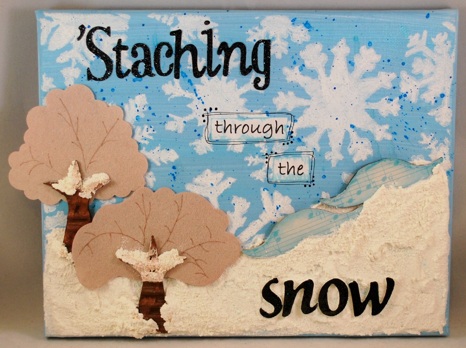
'Staching Through The Snow

Today I have a fun winter project to share.  The weather here is finally starting to cool down, meaning not cold yet but not 100 degrees either.  And it has me thinking ahead to winter fun.

To start this canvas, I painted the background a light blue.  Once the paint was dry, I used a Crafter's Workshop template and stenciled the snowflakes.  Then I splattered ink over the snowflakes for contrast. Lastly for the background, I added a thick layer of SnowTex.  Love this stuff!  I can layer it on thick and achieve a super textured effect.

Both the tree tops and trunks were sprayed with Glimmer Mist. Then I used a brown marker to draw in the tree branches. Next, I added a bit of SnowTex to the tree tops.


On to the 'staches.  I simply covered them both with patterned paper then added a bit of Gelatos to the edges.  I added a bit more Snow Tex around the 'staches to make them appear to be sunk into the snow.  What better way to use a 'stache but as a sled?


With a side view of the canvas, you can really see all the layers of texture.  


And you know I can't make a project without lots of bling, so lets count the number of ways I've added it to this project. :)  Then entire project shimmers and shines.
1.  Glimmer Mist on the trees
2. I added lots of glitter to the Snow Tex
3. Stickles on the word snow
4. I sprayed the entire canvas with French Vanilla Glimmer Mist

Friday, September 14, 2012

Party with Mad Raven!

Welcome back! Today I have a fun, and super sexy, new stamp from Queen Kat Designs and stamp designer Charles Bristow called Mad Raven.

In keeping with the rocker chick theme of the stamp, I knew I wanted to go with a bold color combo, so I chose red and black. 


The entire image is colored with Prismacolor pencils, and the spotlights are highlighted with Stickles. You know I have to get in a bit of sparkle somewhere. :)  And for a bit of dimension, I stamped a second image, fussy cut only the wings, and layered it on the colored image.

Thanks for stopping in today!


Related Posts with Thumbnails